
Exploring the Role of Color in Visual Arts: Techniques and Psychology
When you think about color in visual arts, you might only consider its aesthetic appeal, but there's much more at play. Color theory and its psychological implications can shape the emotions you experience as a viewer. By understanding how warm and cool colors interact, or how artists employ techniques like layering, you can appreciate the deeper narratives embedded within a piece. What if the colors you see are not just choices, but deliberate strategies to evoke specific feelings? Exploring this intersection of technique and psychology could change the way you perceive art altogether.
Understanding Color Theory

Color theory serves as the foundation for understanding how colors interact and influence our perception in visual arts. By grasping the basic principles, you'll enhance your artistic skills and make more informed choices in your work. Start with the color wheel, which showcases primary, secondary, and tertiary colors. Primary colors—red, blue, and yellow—cannot be created from other hues. Mixing these colors produces secondary colors like green, orange, and purple. Exploring different artistic styles, such as vintage art pieces, can also inspire your color choices and compositions.
Next, explore color harmony, which refers to pleasing combinations that evoke specific feelings or moods. You can use complementary colors—those opposite each other on the wheel—for striking contrasts, or analogous colors—those next to each other—for a more serene effect.
Don't forget about value and saturation. Adjusting a color's lightness or darkness, known as value, can create depth in your artwork, while saturation affects the intensity of a color.
Experimentation is key. Try different combinations and observe how they transform your piece's overall impact. By mastering these fundamentals of color theory, you'll develop a stronger visual language that communicates your artistic vision effectively.
The Psychological Impact of Color
Understanding how colors affect emotions can elevate your artwork to new heights. When you choose colors, you're not just making aesthetic decisions; you're tapping into psychological responses that can influence how viewers feel. For instance, warm colors like red and orange can evoke feelings of excitement or warmth, while cooler colors like blue and green often bring a sense of calm and tranquility. The use of rich, deep colors can also celebrate cultural heritage, as seen in pieces like Vakala: African American Goddess, which employs vibrant watercolors to convey power and grace.
Think about the mood you want to convey. If you want to evoke passion or energy, bold reds and vibrant yellows can do the trick. On the flip side, if you're aiming for serenity or reflection, softer blues and greens might be more appropriate.
Your choice of color can also create a narrative. A dark palette might suggest mystery or sadness, while a bright one can symbolize joy and optimism.
As you experiment with color in your art, pay attention to the emotions that arise—not just in your audience, but in yourself. When you understand the psychological impact of color, you can craft pieces that resonate deeply, making your art not just seen, but felt.
Warm vs. Cool Colors

The palette you choose can considerably impact the mood of your artwork, especially when contrasting warm and cool colors. Warm colors, like reds, oranges, and yellows, evoke feelings of energy, passion, and warmth. When you incorporate these hues, you're likely to create a vibrant, inviting atmosphere. Think about how a sunset can ignite your emotions; that's the power of warm colors. Additionally, artworks that promote gratitude, such as the Give Thanks Ultra Cotton Long Sleeve Tee, often utilize warm tones to enhance feelings of positivity and appreciation.
On the other hand, cool colors such as blues, greens, and purples offer a sense of calm and tranquility. If you want to evoke serenity or contemplation in your piece, these colors are your best friends. Imagine a serene ocean scene; the cool tones help convey peace and relaxation.
Using warm and cool colors together allows you to create dynamic contrasts. You can guide the viewer's emotions, drawing them into specific areas of your artwork. For instance, placing warm colors in the foreground can create depth, while cool colors can recede into the background. By understanding the psychological effects of these color groups, you can effectively manipulate mood and convey your intended message, enhancing the overall impact of your art.
Color Harmony and Composition
Creating a visually appealing artwork goes beyond just choosing warm or cool colors; it involves mastering color harmony and composition. When you understand how colors interact, you can create a more coherent visual experience. Start by exploring the color wheel, which helps you see complementary, analogous, and triadic color schemes. These techniques can guide you in selecting colors that enhance each other, making your artwork pop. For instance, just as a personalized design can elevate a simple garment, thoughtful color choices can transform your artwork.
Next, focus on composition. Think about how you arrange your colors within the space. Using the rule of thirds, for example, can help you balance colors effectively, guiding the viewer's eye through your piece. Experiment with different placements to see what feels right, and don't hesitate to move colors around until you find that sweet spot.
Also, consider the emotional impact of colors. Certain combinations can evoke specific feelings, so choose wisely based on the message you want to convey. Remember, you're not just using colors; you're telling a story. By harmonizing your colors and thoughtfully composing your artwork, you'll create a piece that resonates with viewers and elevates your artistic expression.
Color in Different Art Movements

Color serves as a powerful language in the world of art, conveying emotion and meaning across different movements. In the Impressionist movement, for instance, you'll notice how artists like Monet used soft, vibrant hues to capture fleeting moments of light and atmosphere. This technique invites you to experience nature's beauty in a more intimate way, much like how a premium matte vertical poster can enhance your living space with artistic expression.
As you explore Post-Impressionism, you'll find artists like Van Gogh who employed bold, expressive colors to convey intense emotions. His use of swirling patterns and contrasting colors draws you into his inner world, inviting you to feel what he felt.
In the domain of Cubism, pioneered by Picasso and Braque, color plays a different role. Here, you see muted palettes that emphasize structure and form rather than emotional resonance. This shift challenges your perception of reality, pushing you to analyze the subject matter from multiple viewpoints.
Techniques for Color Application
When applying color in your artwork, various techniques can greatly impact the final outcome. One effective method is layering, where you build up colors gradually. Start with a base layer, then add translucent washes to create depth and richness. This approach allows the underlying colors to shine through, giving your piece a vibrant quality.
Another technique is color mixing. Experiment with blending hues on your palette to discover new shades. Using complementary colors can create striking contrasts, while analogous colors provide harmony. Don't shy away from using unexpected combinations; sometimes, bold choices lead to the most exciting results.
Consider the application method as well. Whether you're using brushes, sponges, or palette knives, each tool provides a different texture and finish. Try dry brushing for a soft, feathery effect or stippling for a dappled look.
Case Studies: Color in Famous Works
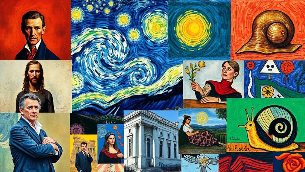
Numerous iconic artworks demonstrate the powerful role color plays in visual storytelling. Take Vincent van Gogh's "Starry Night," for example. The swirling blues and vibrant yellows create a sense of movement and emotional intensity, drawing you into the scene. You can almost feel the energy of the night sky, highlighting van Gogh's psychological state.
Then there's Claude Monet's "Water Lilies," where soft pastels and shimmering reflections evoke tranquility. The colors blend harmoniously, inviting you to linger in the serene landscape. You can't help but appreciate how Monet captures the essence of light and nature.
In Pablo Picasso's "Guernica," the stark black, white, and gray palette reflects the horror of war. The absence of color intensifies the emotional impact, forcing you to confront the tragedy depicted.
Each of these masterpieces shows how color isn't just about aesthetics; it's about conveying deeper meanings and emotions. By analyzing these case studies, you gain a clearer understanding of how artists use color to shape your experience and interpretation of their work. So next time you view art, pay attention to the colors—they're telling a story you won't want to miss.
The Future of Color in Art
As technology continues to advance, the future of color in art is poised for exciting transformations. Digital tools and software are evolving rapidly, giving you access to a broader color palette and innovative techniques. Imagine using augmented reality to enhance your artwork, allowing viewers to interact with colors in real-time. This could change how you express emotions and concepts through color, creating immersive experiences.
Moreover, advancements in materials science are leading to the development of new pigments with unique properties. These eco-friendly colors not only offer vibrant hues but also reduce environmental impact. You might find yourself experimenting with these materials, pushing the boundaries of traditional art forms.
Community engagement is also on the rise, thanks to social media platforms. You can share your work and gather feedback instantly, influencing your color choices based on audience reactions. This collaboration can lead to fresh ideas and trends that you might not have explored otherwise.
In essence, the future of color in art promises to be dynamic, integrating technology, sustainability, and community interaction. Embrace these changes, and let them inspire your creative journey. The possibilities are endless!
Read The Next Blog Post –
In exploring color in visual arts, you've uncovered its emotional power and technical applications. Did you know that up to 90% of snap judgments about products or artwork are based on color alone? This statistic highlights just how essential color is in shaping perceptions and experiences. As you continue your artistic journey, remember that mastering color theory and its psychological impact can elevate your work, allowing you to communicate deeper narratives and evoke stronger emotions.

Reach Out
Our Services:
Blog Post Writing
We do well-researched, timely, and engaging blog posts that resonate with your clientele, positioning you as a leader in your field of expertise.
Content Writing
Beyond articles and content for blogs, we delve into comprehensive content pieces like eBooks, and case studies, tailored to showcase your expertise. Website Content Writing: First impressions matter. Our content ensures your website reflects the professionalism, dedication, and expertise you bring to the table.
Social Media Management
In today’s interconnected world, your online presence extends to social platforms. We help you navigate this terrain, ensuring your voice is consistently represented and heard.
WordPress Website Maintenance
Your digital office should be as polished and functional as your physical one. We ensure your WordPress site remains updated, secure, and user-friendly.
For more information, ad placements in our blog networks, article writing, social media management, or listings on our Google News portal, reach out to us at theriversideartists@gmail.com.
Warm regards,
The Riverside Artists Team theriversideartists@gmail.com

Tony Ramos
Article Content Writer We write content articles for all businesses. We produce content that can include blog posts,website articles, landing pages, social media posts, and more. Reach out for more information to theriversideartists@gmail.com, "Best to You" Tony.


Similar Posts
AIC Scheme Development Support Role: Open Call | The Arts Council

Juried Art Exhibitions, Competitions, and Contests